

From choosing the neon fuchsia Pantone to collaborations with Eevye and Sportful: here is how ATCommunication redesigned underground aesthetics and the sense of belonging.
In sports event marketing, merchandise is too often dismissed as a secondary element: just a t-shirt with a stamped logo or a random gadget thrown into the race pack. For us at ATCommunication, however, official apparel is the most powerful vehicle for brand identity. It is a wearable manifesto, a symbol of belonging that outlives the event itself.
For the fifth edition of GeoGravel Tuscany – Le Strade Grigie, the goal was ambitious: elevate the brand’s positioning, make it instantly recognizable, and create an aesthetic common thread capable of bridging everyday lifestyle with technical racing gear. The strategic answer? An official “GeoPalette” dominated by neon fuchsia and a disruptive graphic concept inspired by the ’90s.
The Color Strategy: Neon Fuchsia as an underground manifesto
Every year has its visual signature. For 2026, we wanted to dare by introducing an iconic, hyper-saturated, and vibrant color: neon fuchsia. Far more than a mere aesthetic choice, this color is a true cultural symbol. It evokes the underground aesthetic and rave culture of the ’90s, oversize jackets, the first iconic mountain bikes, and that healthy desire for visual rebellion and breaking the rules that perfectly matches the “wild” philosophy of the gravel world.
On the dusty Tuscan roads, this cold and electric color cuts through the dust and earth like a neon light in the dark, guaranteeing an immediate visual impact.
The Lifestyle Brand: The streetwear collection with Eevye Official
To take GeoGravel outside the strictly cycling context and integrate it into daily life, we managed the collaboration with Eevye Official for the lifestyle hoodie and t-shirt line. Launched for pre-order on April 1st, the collection combines essential shapes with a powerful visual language.
The real stroke of strategic genius was the contrast: if neon fuchsia is the shout, the tartan pattern detailed on the pocket is the memory. We took the traditional Scottish Highlands weave, historically linked to the concepts of clans and belonging, and reinterpreted it with a contemporary twist. The strategic message is clear: anyone participating in GeoGravel becomes part of a “GeoClan”—a community that recognizes, meets, and chooses one another, regardless of where they come from or how hard they pedal.
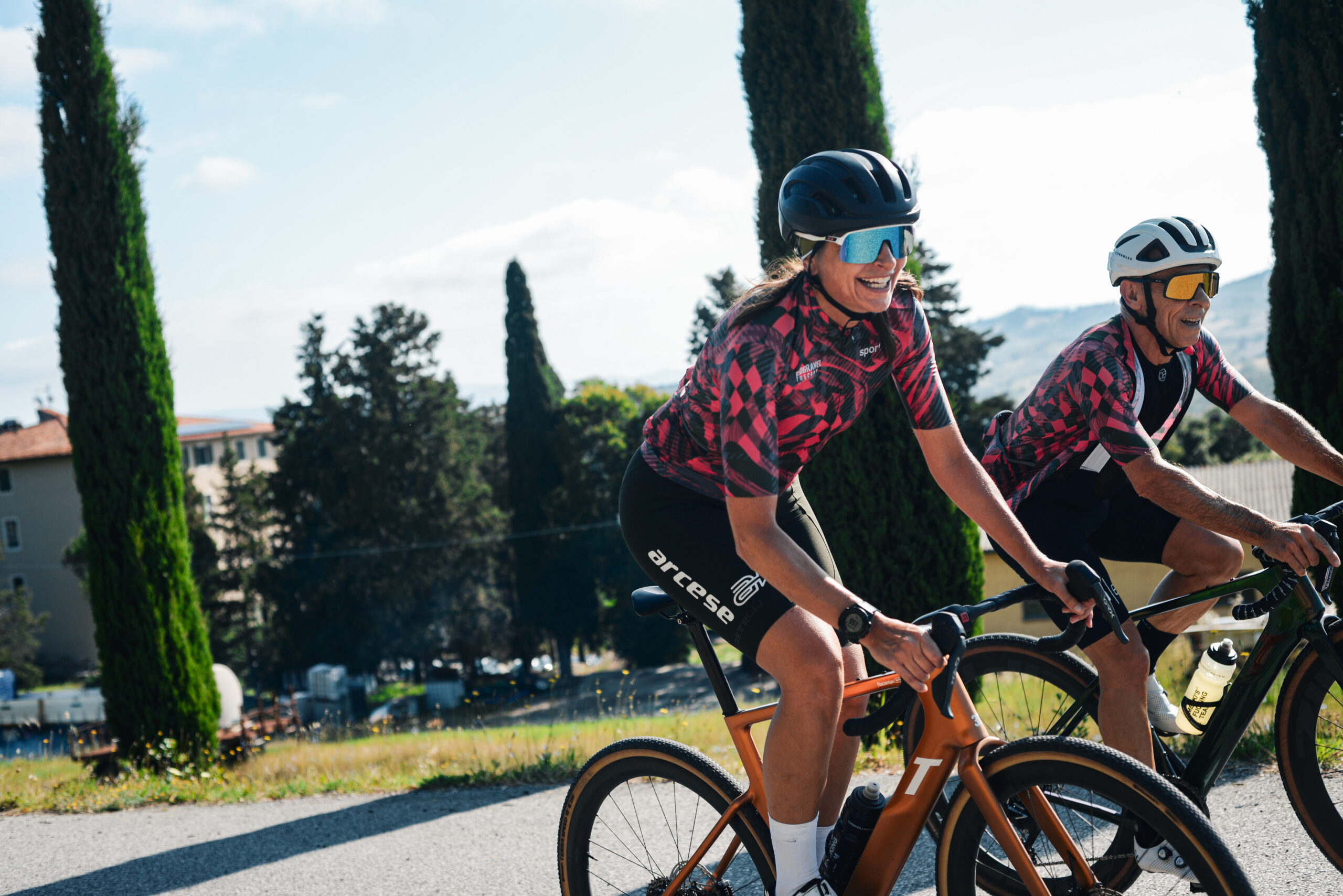
The Technical Evolution: The Sportful Kit and “Jumanji Vibes”
The positioning of the merchandise line found its ultimate technical expression in the partnership with Sportful, a brand that has been leading cycling innovation since 1972 and proudly supports Paolo Bettini and his initiatives. For the 2026 official technical kit, we pushed the envelope on deconstructing classic patterns.
The Scottish tartan abandoned its geometric and static nature to embrace what we defined as a “Jumanji Vibes” lens. The weave of the threads was transformed into a dynamic visual labyrinth reminiscent of wild jungle roots. Merged with the power of neon fuchsia, the 2026 Sportful kit became a perfect blend of technical performance and “Wild 90s” aesthetics, redefining the standards of gravel apparel.
Want to transform your brand or event merchandise into a cult favorite? From creative direction to choosing strategic partnerships and developing the visual concept: we help your brand speak a unique, memorable language capable of bringing people together.
Get in touch with us today!